Design guidelines
Intro
Our visual style represents how we communicate without words. This page is designed to help maintain Qwaderton’s consistency and brand recognition across all media.
Logo
Muzzle
Created in 2023, our first logo revolves around the geometric, rounded letters "Q" and "a" connected by the letter "w".
Wordmark
And our modern wordmark was created as an extension of the muzzle concept.
Mill
We used this logo for a period to symbolize movement, progress, depth, and simplicity.
Along with this wordmark set in the Urbanist font.
We no longer use them, though we might revisit them in the future.
Usage Policy
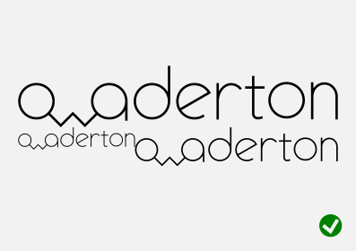
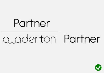
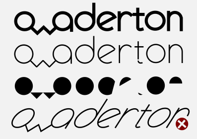
Do's and Don'ts: Wordmark
Do's and Don'ts: Muzzle
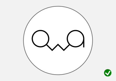
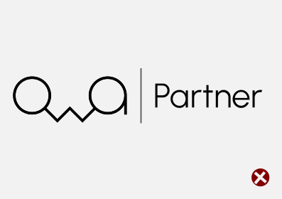
How to use our logos
Do:
- Use the logo only when directly referring to or partnering with Qwaderton.
- Maintain original aspect ratio, vector paths, and colors.
- Provide adequate margin/clear space around the logo.
- Acknowledge that all logo assets remain the property of Qwaderton.
- Follow the design guidelines above and use common sense.
Do not:
- Use the logo to imply endorsement, affiliation, or sponsorship without permission.
- Combine the Qwaderton logo with other logos or third-party graphics.
- Sell, license, or redistribute the logo assets as standalone files.
- Use our brand assets in a misleading, defamatory, or unlawful context.